CLIENT : The Wedding Co.
WEBSITE : Created new Website in 2012, after the first issue of the Wedding Co. magazine, and then redesigned again in 2014, focusing on keeping ‘The List’ up on every page as a priority and making it a responsive design. Most of TWC’s client base return regularly to that part of the site for easy access. The home page opener photo rotates to a different photo when page refreshes.
PHOTOGRAPHY: Various photographers from Real Wedding shoots.
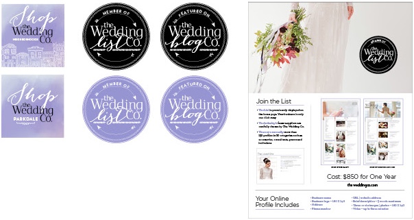
LOGO: Redesigned logo after first issue of the magazine based on having option to change the tag line, depending on event or promotion.
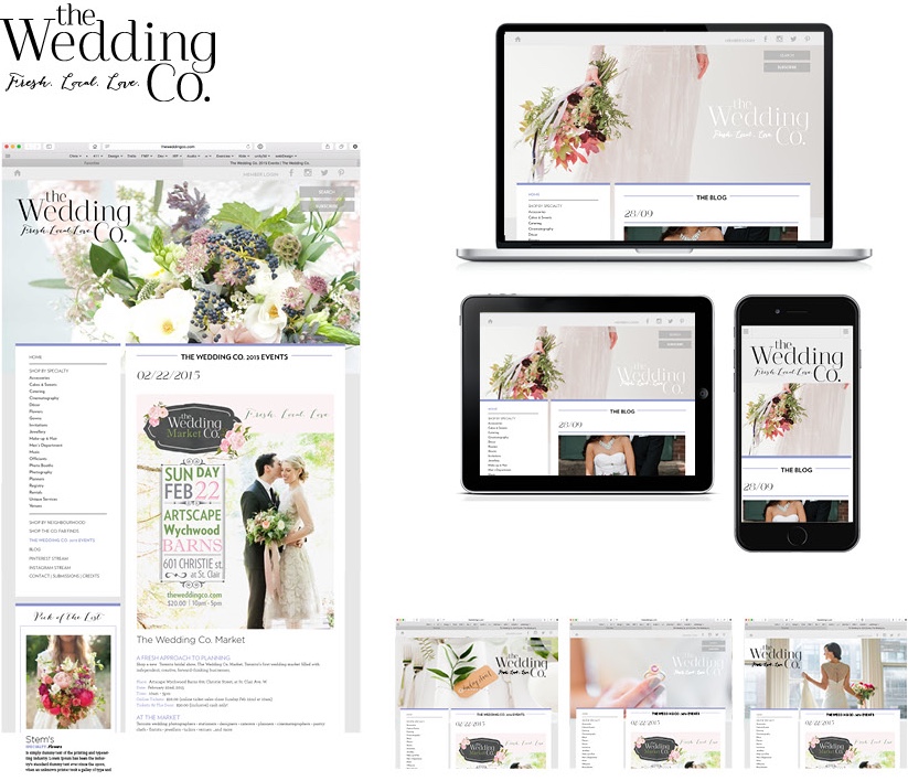
BADGES: Designed badges, buttons on website to start off sections and highlight events or an idea.
LIST PAGE FOR WEB : Created the List page for potential new subscribers.

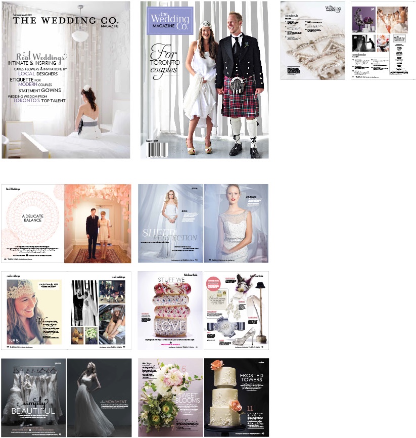
THE MAGAZINE:
Design directed two issues 2012, 2013
Photography: Various photographers from Real Wedding shoots, Natasha V, Gabor Jurina, Genevieve Caron, Dan Lim.
LOGO redesign: Created logo, business cards (front and back)
WEBSITE BANNERS: Created rotating banners for the first website design, 2012
PHOTOGRAPHY: Various photographers from Real Wedding shoots.
ILLUSTRATION:
Lace illustration, Tina Berning

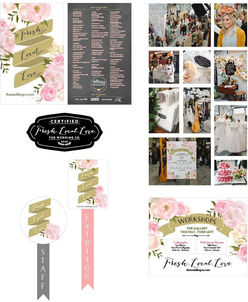
PROMOTIONAL COLLATERAL:
Designed show exhibitors 4X8” card, stamp for the bags and natural muslin aprons, buttons and ribbons for the exhibitors and staff, and posters for thanking sponsors and workshops.
The Wedding Co. Show at the Wychwood Barns, Toronto 2015, first annual show at this venue. TWC wanted to create an open local market feel with a springtime rose theme. A welcome cart made from paper roses greeted guests at the entrance. Also, in keeping with the theme, custom pink rose- patterned paneled curtains floated high above the exhibitors booths.
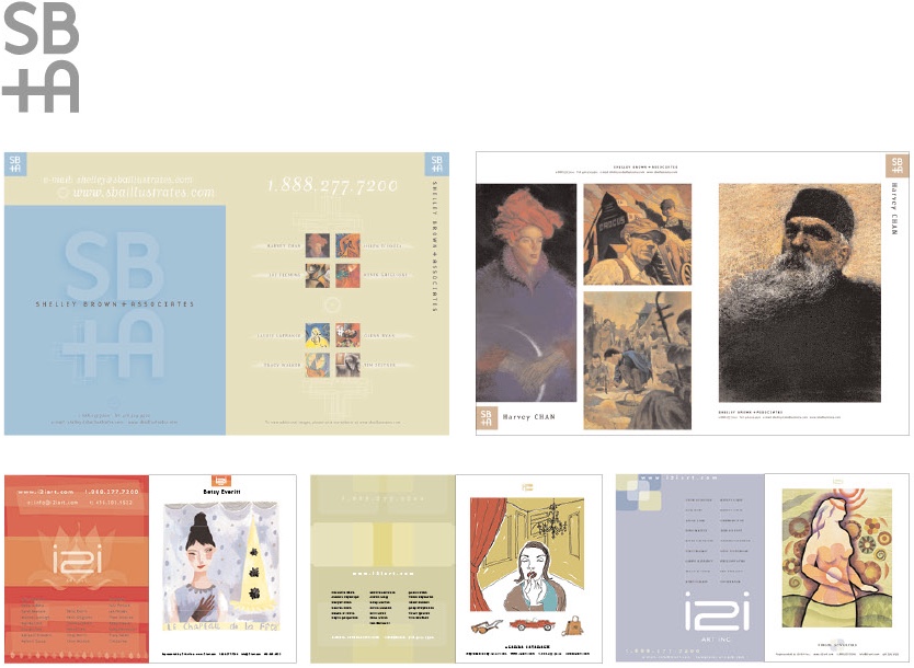
CLIENT : i2i art.com
Shelley Brown and Associates, Illustrator representative
WEBSITE: Designed website 3 times since the mid 1990’s-2014. Shelley has certainly evolved her promotion from the days of print only to the introduction of the Internet. From designing 2 simple websites in the late 90’s to another redesign of a wordpress website later in the mid 2000’s, this enabled i2i flexibility to upload all images and edit text giving total control of content. The large format photo on the home page rotates many illustrations from various i2i artists, as the page opens or refreshes, giving fair representation and also changes up the home page.
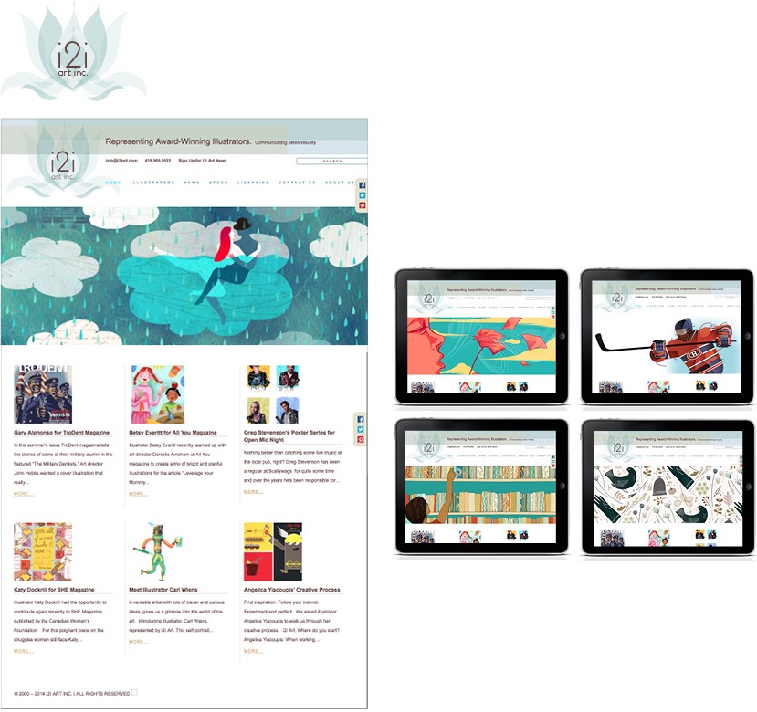
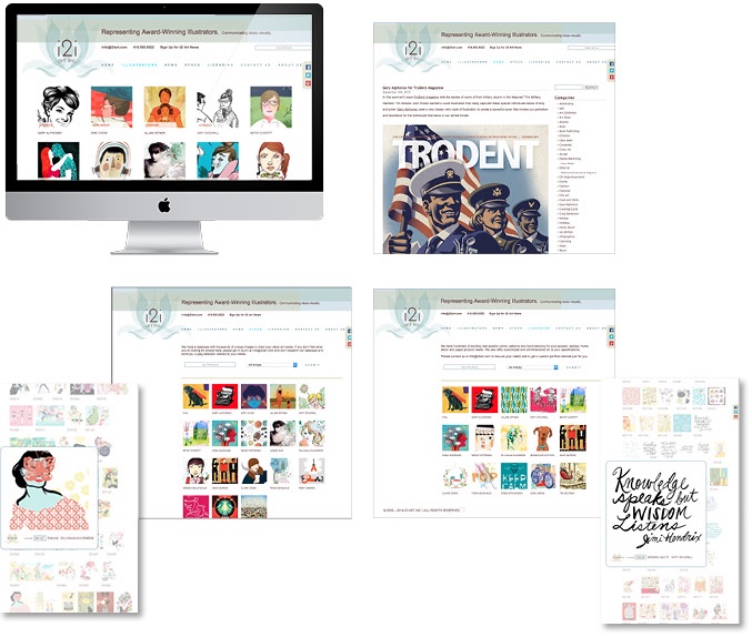
LOGO, Identity, Promotional collateral Redesigned i2i art logo twice, SB + A logo and above i2i logo with lotus. Also designed promotional books/collateral from 1996-2011.
THE WORKBOOK : Print Promotional pages ILLUSTRATIONS: Various illustrators of i2i art.com. throughout the years. Below:
Harvey Chan, Betsy Everett, Alanna Cavanaugh, Tracy Walker
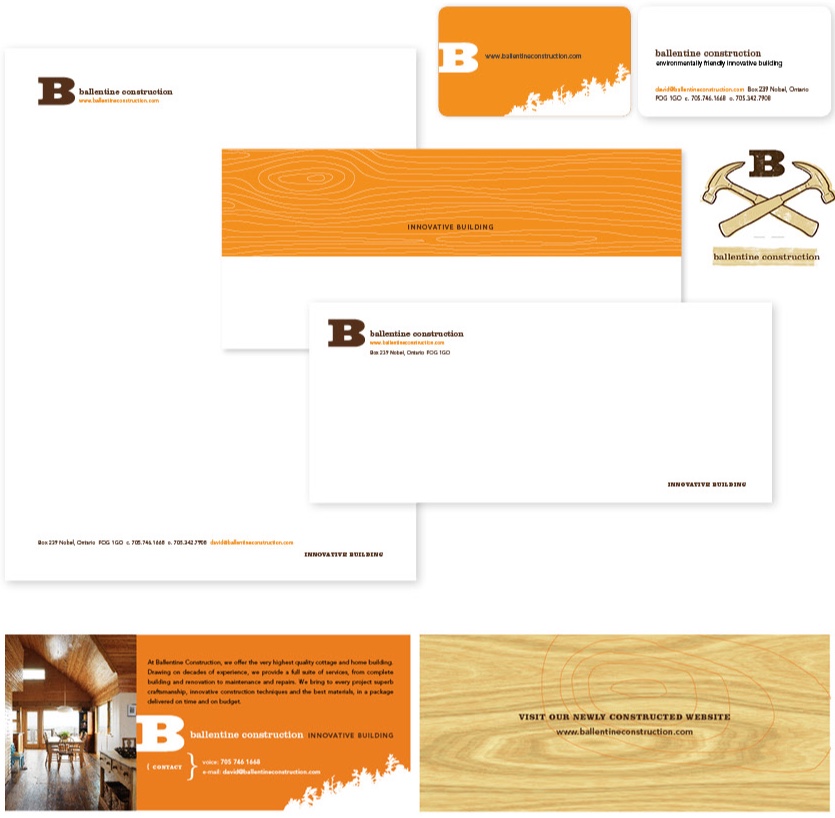
CLIENT: Ballentine Construction.com
David Ballentine, Contractor, Parry Sound and Pointe au Baril, Ontario
PHOTOGRAPHY: Virginia MacDonald and Donna Griffith
WEBSITE: David Ballentine wanted to design a site that was functional with easy navigation and beautiful photography that would show off his work.
I designed a site with a large photograph to take fill a full screen opener. There are five different large photos that rotate randomly at the open, and each photo continues to morph to the next one creating a nice fluid effect (middle photo). From there, the menu sits on the transparent bar, where the user is able to see the various different cottages built, restored, or maintained by the company. The wood rings and the slanted trees are indigenous to the area, and are key elements of Ballentine Construction’s identity.
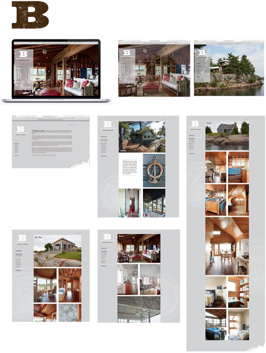
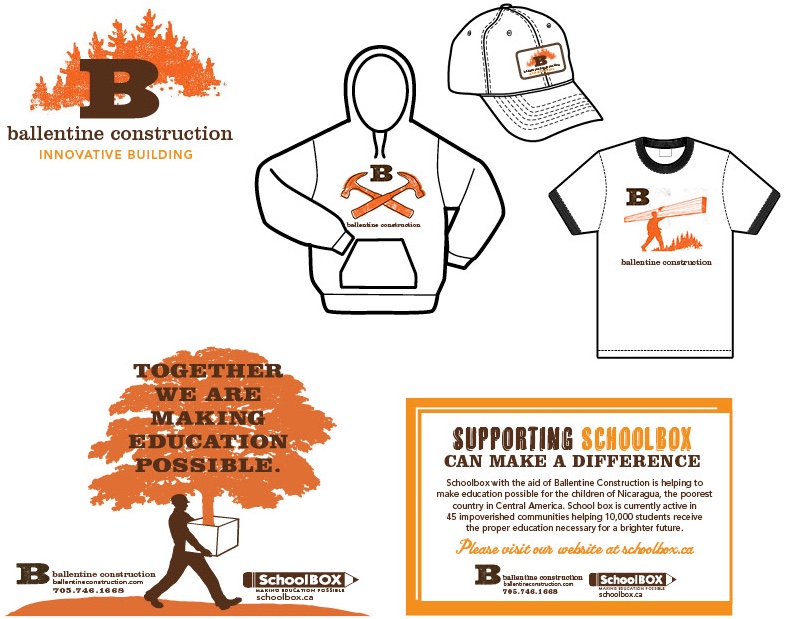
IDENTITY: Business Cards were created on a double thick 130lb uncoated cover stock to give the card extra weight to make it feel more masculine and substantial.
Created an outdoor ‘woodsy feel’ to the identity by stamping the B initial with a retro wood-burn, distressed look. The slanted trees are indigenous in this northern area of Ontario, and I thought this was a great way to represent his identity. The artwork on the trucker style hat, muslin colored t-shirts, brown hoodies, brown long sleeve baseball shirts are all in keeping with the rugged theme of the great North.
ILLUSTRATIONS: Dan Paige
PROMOTION:
Designed Ballentine Construction worker uniform which included a trucker-style hat with an embroidered retro patch look, a hoodie, short sleeved and baseball long sleeve t-shirts for the changing seasons.
ILLUSTRATIONS: Dan Paige
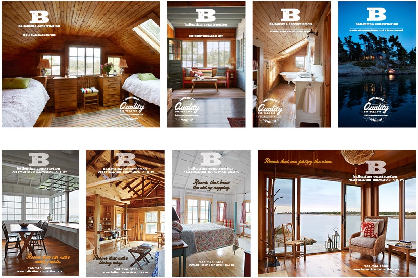
ADVERTISING: A series of 4 ads (6X9”), designed annually for print, were strategically positioned throughout the local annual Islander’s Association book called PABIA Islander’s directory. The book’s content is full of editorial articles, along with a directory of cottagers in the Pointe au Baril area. The series above were from 2015 and the ones below were from 2014.
PHOTOGRAPHY: Virginia MacDonald
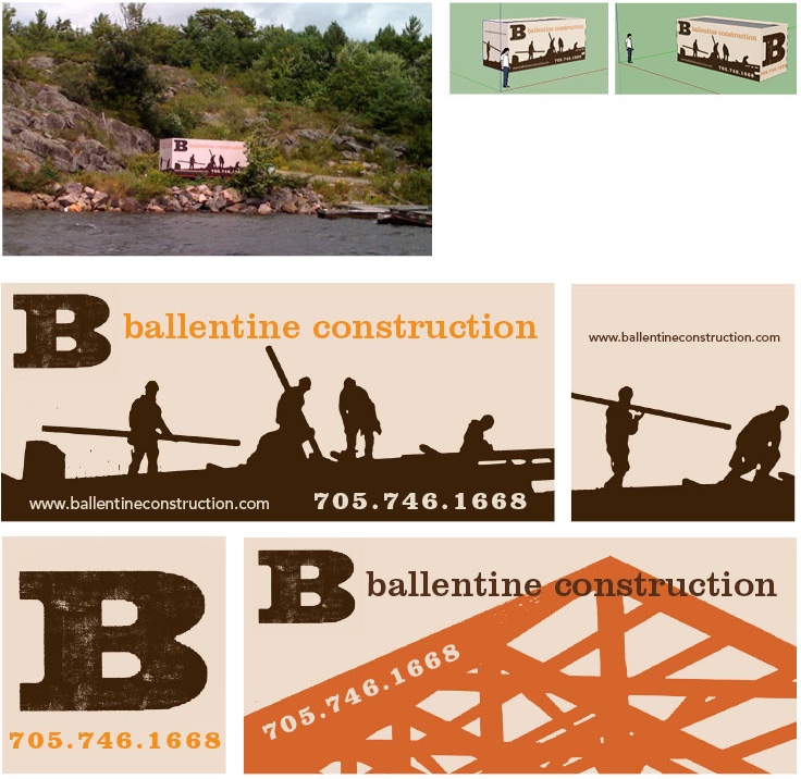
ADVERTISING: wrapped container (20X8”)
Perched right beside the Point au Baril dock where boats come and go to and from their cottages, this 4 sided wrapped corrugated container serves as an effective way to advertise the company and also serves as a storage unit for David and his crew to access tools and equipment.
ILLUSTRATIONS: Dan Paige
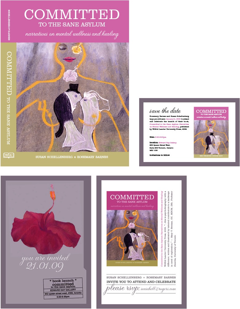
CLIENT : Wilfred Laurier Press
ILLUSTRATIONS: Susan Schellenberg
BOOK DESIGN & INVITE:
Writers Rosemary Barnes and Susan Schellenberg asked me to design a book cover and accompanying folded 5X7” invite book launch card (front and inside), and a ‘save the date’ e-card. It’s a story of a woman’s journey of overcoming addiction/abuse in the late 70’s and early 80’s through art. The card was created with this serious subject matter in mind, and therefore used bright color to contrast and signify hope. The cover’s illustration and the hibiscus flower on the invite, both from the artist patient’s many paintings, represented the female role in relationship, fertility, and growth. The card subtly resembled a clinic psychology file, a reminder from years of treatment.
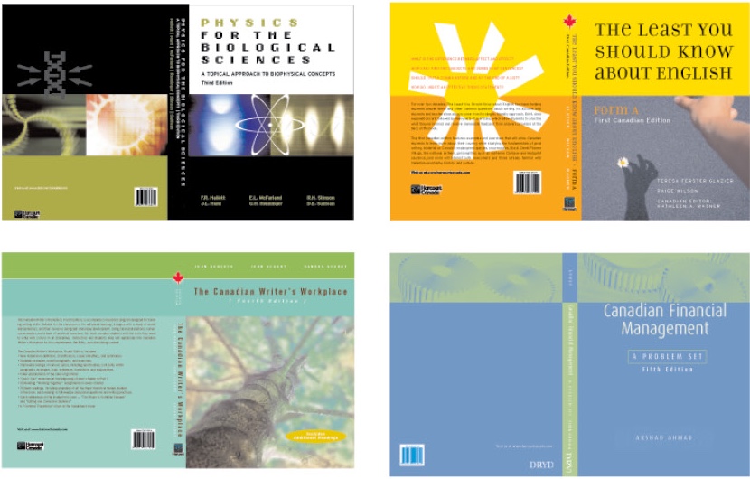
CLIENT: Harcourt Canada
BOOK DESIGN
Designed various book covers for Harcourt’s Education Division.
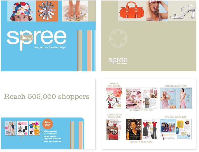
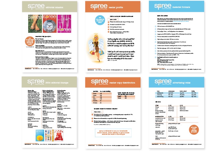
CLIENT : The Hudson’s Bay Co.
Cossette Communications, Toronto
SALES KIT: Folder (9”X12”), sales sheets
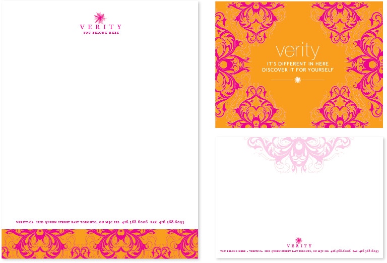
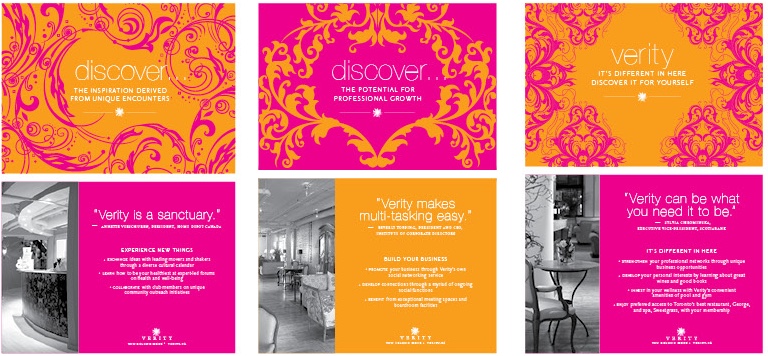
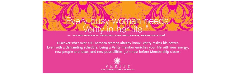
CLIENT : The Verity Club, Toronto
Cossette Communications, Toronto
PROMOTION: Stationary, calling cards, company card promotion, and ad for exclusive Woman’s club downtown Toronto. Attached to the George Restaurant, Ivy Hotel rooms, and the Sweetgrass Spa, the Verity’s interior space felt feminine, warm and inviting. A mix of eclectic modern meets rustic old world charm, I wanted to echo the bright patterned walls with their identity.
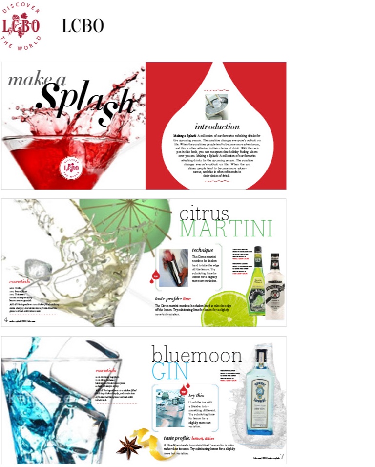
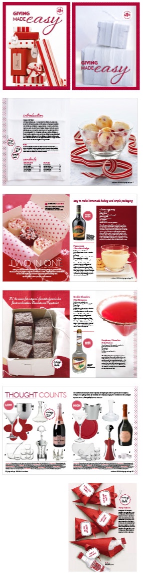
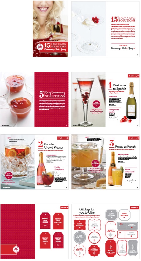
CLIENT : LCBO, Karen Lim Design
ADVERTISING BOOKLET MOCK-UPS: Designed and produced promotional mock-ups for proposals. Below are 3 different proposal ideas based on a theme for a specific season.